layout & Spacing
A better way to control spacing
Table of Contents
Elementor's default spacing
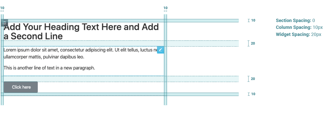
Elementor’s baseline spacing is a bit tight and needs to be overridden on almost every section and column. Keeping spacing consistent – especially across devices – can be tedious and difficult, especially if you want to make spacing changes to multiple sections throughout the site.

Design Rangers section and column spacing
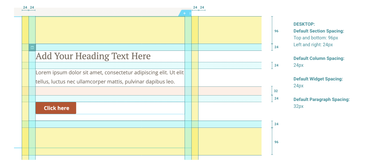
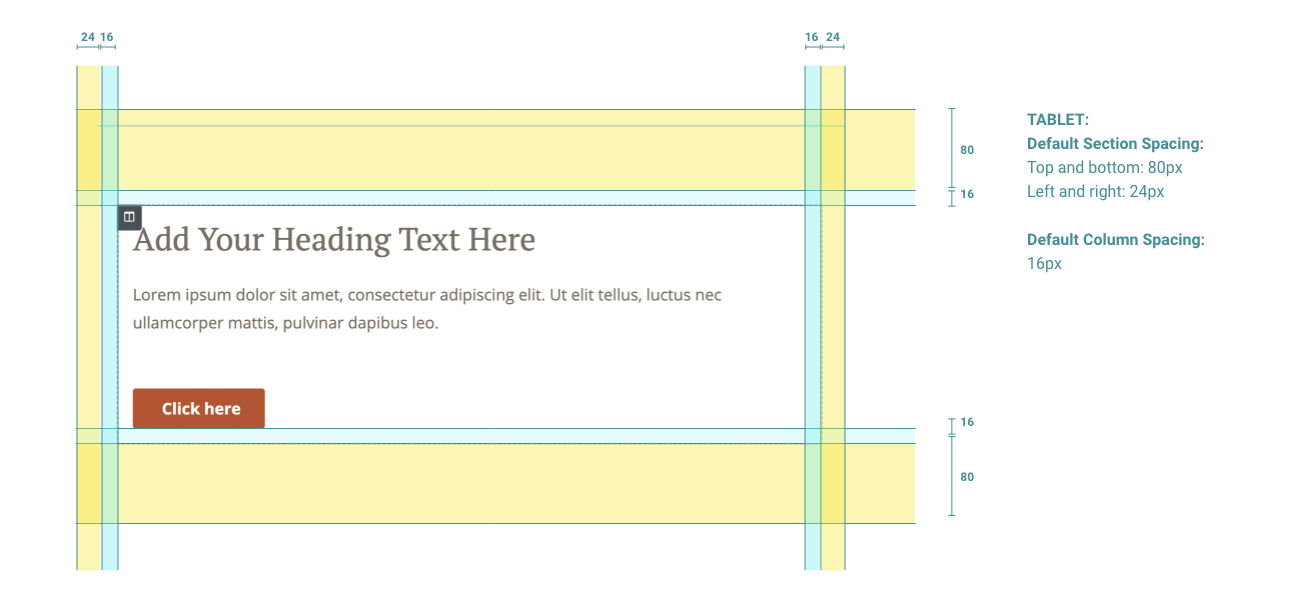
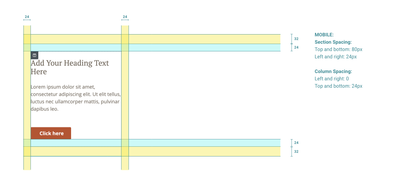
We’ve updated the default spacing to add a bit more breathing room, create consistent left and right margins, and use the 8pt grid as the underlying spacing system. The spacing allows for margins on all devices so that text does not run into the sides of the screen. These defaults are set in the child theme.
Desktop

Tablet

Mobile

See how spacing works live in the section below
Section, column, and widget spacing
- Section spacing – left and right are a consistent 24px on all devices to keep a consistent gutter. Top and bottom padding is controlled through custom dropdown fields in Elementor.
- Column spacing – 24px all the way around on desktop, 16px on tablet, and 24px top and bottom with collapsed left and right padding on mobile.
- Widgets spacing – 24px set globally in Elementor’s site settings
Adjusting top & bottom section spacing
Section spacing top & bottom options
Adjusting the spacing between sections is something we do often. To ensure consistency and make it quick to adjust the spacing, we’ve added custom controls to Elementor’s sections.
In the layout tab of the section settings, you’ll see section spacing: top & section spacing: bottom controls.
These can be adjusted to various options from no space all the way up to XXL spacing.
Inner section spacing
Rules for using inner sections
Inner-sections can be a great way to keep related content together. However, it can make spacing inconsistent and difficult to control. To keep spacing consistent, there are two key rules we adhere to when using inner sections:
1. One inner section in a column = all inner sections in a column
If you use one inner section, always use inner sections for every other element, even if it’s just for a single headline. This will ensure that all elements have consistent spacing without adjustments. You can still use the section spacing controls on inner sections. As an example, this section uses all inner sections as an example.
2. Zero-out padding on the column that holds the inner sections
Set the padding in the column that contains the inner sections to “0”. This will let the other sections and columns maintain their set spacing without adding extra padding.
